How to Automate Plus AI Presentations from Google Sheets (2026)
You can automate Plus AI presentations from Google Sheets by using a Zapier workflow that triggers every time you add or modify a spreadsheet row. By mapping your spreadsheet headers to Plus AI prompt fields, the system generates a full slide deck based on your row data. This process creates a hands-off reporting pipeline where your spreadsheet acts as the primary source of truth.
Imagine this scenario: it is Monday morning, and you have fifteen different project updates sitting in a Google Sheet. Traditionally, you would spend hours copy-pasting data, adjusting font sizes, and hunting for the right slide layout. A project management team encountered this exact problem last year. They were drowning in manual reporting until they realized they could treat their data like a script. Instead of manually building slides, they began triggering them through automation. This shift changed their entire workflow from design-heavy to data-focused. You likely know the frustration of wasting energy on repetitive formatting.
You do not need to be a developer to build this. Specifically, if you can fill out a spreadsheet, you have already done the hard part. That team saved about six hours every week by letting the AI handle the heavy lifting. While many people use AI to write a single email or a short summary, the real power lies in these presentation-as-code pipelines. It involves moving beyond one-off prompts and building a system that works while you sleep. Here is how you can set up how to automate plus ai presentations from google sheets for your own workflow.
How to set up the Google Sheets to Plus AI Zapier workflow?
Setting up the automation requires a Zapier account to act as the bridge between your data and your design. You start by creating a new Zap where the trigger is Google Sheets and the event is “New or Updated Spreadsheet Row.” This ensures that every time you finish a row of data, the automation begins. You’ll need to connect your Google account and select the specific spreadsheet and worksheet you want to monitor. It is a straightforward process that takes about five minutes if your files are ready. To configure the Plus AI action, follow these precise steps in the Zapier editor:
- Authenticate: Log into your Plus AI account within the Zapier interface to authorize the connection.
- Select Event: Choose “Create Presentation” from the action dropdown menu.
- Map Fields: In the “Presentation Prompt” field, use the dynamic data pills from your Google Sheet. For example, use “Create a summary for [Project Name] with these key results: [Metrics].”
- Set Slide Count: Define the length of the presentation to ensure the AI does not exceed your requirements.
- Test the Step: Always run a test to verify that the AI interprets your spreadsheet data correctly before turning the Zap on.
Once the trigger is live, every new row becomes a slide deck. The quality of the slides depends on the clarity of your prompt. If your row data is messy, the AI might produce inconsistent results. I suggest starting with a small 3-slide deck for initial testing. Once you see how the data maps to the slides, you can increase the slide count. If you are unsure which automation tool fits your specific business size, you can use a tool finder to compare different workflow options.
How to format your spreadsheet columns for optimal AI slide generation?
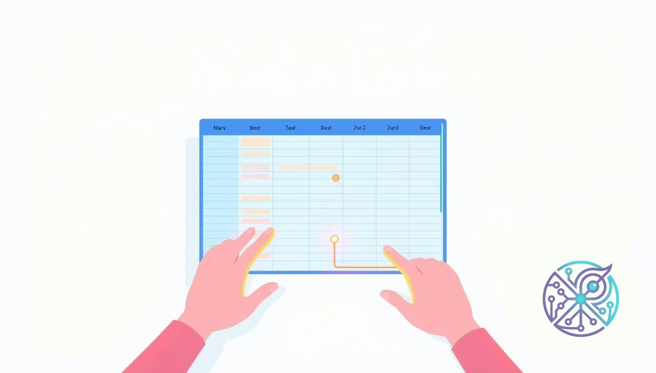
A clean spreadsheet is the difference between a professional deck and a digital mess. To ensure the AI interprets your data types correctly, you should follow standard Google Sheets API data structures which emphasize clear headers and consistent cell values. Avoid merging cells or using complex formatting inside the Sheet itself. The AI reads raw text, so keep your columns focused on one specific piece of information at a time. This makes the data mapping stage in Zapier much more reliable.
Think of your spreadsheet as a structured outline. One column should be the “Theme” or “Goal” of the presentation. Another should contain the “Key Stats.” A third might hold the “Call to Action.” When the AI sees these distinct blocks of text, it can assign them to different slides effectively. If you lump everything into one giant column, you will end up with cluttered slides. It is better to have ten narrow columns than two wide ones. This granularity allows for much better google sheets to google slides ai automation results.
Use the following data mapping template to organize your spreadsheet headers for the Plus AI prompt builder:
| Spreadsheet Header | AI Prompt Role | Expected Slide Output |
|---|---|---|
| Project Name | Context Provider | Title Slide and Headers |
| Key Metrics | Data Source | Bullet points or Chart data |
| Next Steps | Instruction | Conclusion slide content |
| Tone/Style | Formatting Guide | Overall voice and vocabulary |
One limitation to remember is that the AI cannot see your spreadsheet colors or bold text. If you use red cells to indicate urgency, the AI will miss that context. You must write the word “Urgent” into a column for the automation to pick it up. Since you’re working with automation, you might also want to explore productivity tools for teachers or professionals that help manage these repetitive data entries. Clean data leads to clean designs.
Can you automate slide updates when a Google Sheets row is edited?
You can automate updates, but you need to be careful with how you trigger the Zap. Most people default to the “New Row” trigger, which works for one-off presentations. Yet, if you want a living presentation that changes as your data evolves, you must use the “Updated Spreadsheet Row” trigger. This allows you to revisit an existing deck and refresh the content based on the new information in that specific row. This is a core part of any plus ai zapier integration guide for advanced users.
The update logic is more complex because you need to track the Presentation ID. When you first create a presentation via Zapier, the tool returns a unique ID. You should save this ID back into a column in your Google Sheet. For future updates, your Zap can look up that ID and tell Plus AI to modify that specific deck rather than creating a brand new one. This prevents your Google Drive from becoming a graveyard of duplicate files. It is a much more efficient way to handle automated reporting with google sheets.
| Feature | New Row Trigger | Updated Row Trigger |
|---|---|---|
| Primary Use | Initial creation of unique decks. | Maintaining and refreshing existing decks. |
| Logic Difficulty | Low (Single step mapping). | High (Requires ID lookup and storage). |
| File Management | Creates new files every time. | Modifies one master file repeatedly. |
| Best For | Sales pitches, onboarding. | Weekly KPIs, live dashboards. |
The best automation isn’t just about creating something new; it’s about maintaining what already exists without manual effort.
— Systems Management Journal
Still, a catch exists. If you have already manually edited the slides in Google Slides, an automated update might overwrite your changes. Plus AI tries to be smart, but it cannot always reconcile manual tweaks with new data injections. Skip this update workflow if you plan on doing heavy manual design after the AI generates the initial draft. If you are just starting out with design automation, checking out software for beginners can help you understand the balance between AI generation and manual control.
What are the best templates for data-driven Plus AI presentations?
Choosing the right template involves matching the shape of your data to the layout of the slides. If your Google Sheet is heavy on numbers, you need a template that prioritizes charts and tables. If it consists mostly of text-based project updates, look for “Project Status” or “Executive Summary” layouts. Plus AI offers various presets, and the best ones for automation have consistent structures. These templates make generate presentations from spreadsheet data ai a fluid experience because the AI knows exactly where the title and body should go.
For sales teams, the “Quarterly Business Review” template is a top choice. You can map your CRM export directly into the sheet, and the AI will build a deck that looks professionally designed. For internal teams, a “Weekly Sprint Update” template works well. It keeps everyone aligned without requiring a designated person to handle slides every Friday. You might also find inspiration in engaging presentations in Acrobat if you need to convert your final slides into polished PDFs for external clients.
- Sales Pitch: Focus on columns for “Problem,” “Solution,” and “Pricing.”
- Monthly Reporting: Use columns for “Last Month’s Goal” and “Actual Results.”
- Onboarding Decks: Map “Employee Name,” “Role,” and “Week 1 Tasks.”
- Market Analysis: Use headers for “Competitor,” “Strength,” and “Weakness.”
One common mistake is choosing a template that is too complex for the data provided. If your row only has twenty words of text, a 10-slide template will feel empty. Match the volume of your spreadsheet data to the length of the template. A good rule: one column of substantial text equals one slide. If you have five columns of data, a 5-slide presentation is usually the best fit for your automated reporting pipeline.
The ‘Presentation-as-Code’ workflow: Your sheet as a headless CMS
Professional industries are entering an era where spreadsheets are becoming headless CMS platforms for design. In this model, you never actually open Google Slides. You treat the spreadsheet as your control center. This presentation-as-code mindset means you focus entirely on the logic and the data. If the data is correct in the Sheet, the presentation will be correct in the Drive. This represents the ultimate goal of a no-code workflow: decoupling the content from the container.
This approach is powerful for scaling. Imagine you need to create 100 personalized decks for a conference. Doing that manually is impossible. But with a spreadsheet-to-slide logic, you just paste 100 rows of data into your sheet, and Zapier triggers 100 Plus AI actions. Within minutes, you have a folder full of custom presentations. It is a level of productivity that was previously reserved for developers with custom scripts. Now, it is available to anyone with a basic understanding of triggers and actions.
The results are surprising for many teams who previously thought they needed a design agency for these tasks. By using a spreadsheet-to-slide logic, they regained control over their time. It is not about replacing designers; it is about freeing them from manual data entry so they can focus on high-level strategy and creative direction. This automated reporting pipeline is a professional standard for corporate communication.
Plus AI Pricing and Automation Limits
While the automation sounds ideal, you must watch the costs. Zapier and Plus AI both operate on tiered pricing models. On the free tier of Zapier, you might only get 100 tasks per month, which disappears fast if you update rows frequently. Plus AI also has limits on how many presentations you can generate per month depending on your plan. It is important to calculate your expected volume before you commit to this as your primary reporting tool. Usually, the $20 monthly range for a professional plan provides the best balance of features and limits.
Another limitation is the polling interval. Unless you are on a high-tier Zapier plan, the automation might not be instant. It might take 15 minutes for the tool to check your Google Sheet for new data. If you are in a rush and need a deck immediately, this delay can be frustrating. You’ll also want to keep an eye on your Google Drive storage, as automated workflows can generate hundreds of files that you might forget to delete later.
- Zapier Tasks: Each new row uses at least one task.
- Plus AI Credits: Check if your plan allows for bulk generation.
- Polling Time: Expect a 2-15 minute delay on lower-cost plans.
- Data Freshness: The AI only knows what is in the sheet at the moment of the trigger.
This workflow will not work when you need highly specific, pixel-perfect branding that deviates from standard AI layouts. If your brand guidelines require every line to be a specific weight and every image to have a specific filter, you will still need a human designer. Still, for 90% of business presentations where clarity and speed are the priorities, this automation is a significant advancement. It is a small investment that pays off in reclaimed hours and reduced stress.
Automating your presentations is about reclaiming your most valuable asset: time. Start by picking one recurring report and moving it into a dedicated Google Sheet. Connect it to Plus AI via Zapier using the steps we discussed. Do not try to automate your entire business in one afternoon. Just get that one workflow running, see the first deck land in your inbox, and you will never want to go back to manual slide design again. By treating your data as the source of truth, you create a sustainable system that grows with your organization.
FAQ
Can I use multiple Google Sheets to feed one presentation?
Yes, by using Zapier’s multi-step actions, you can pull data from various worksheets and combine them into a single Plus AI prompt. This allows for complex reports that aggregate data from different departments.
Does the automation support images from the spreadsheet?
Plus AI primarily focuses on generating layouts and text from spreadsheet data. If your template supports dynamic media, you can provide image URLs in your columns which the AI can often incorporate into the slides.
How do I stop the automation if I hit my task limit?
You can pause your Zap in the Zapier dashboard at any time to prevent further task consumption. Additionally, setting up filters in Zapier ensures only specific rows meeting your criteria trigger the generation process.